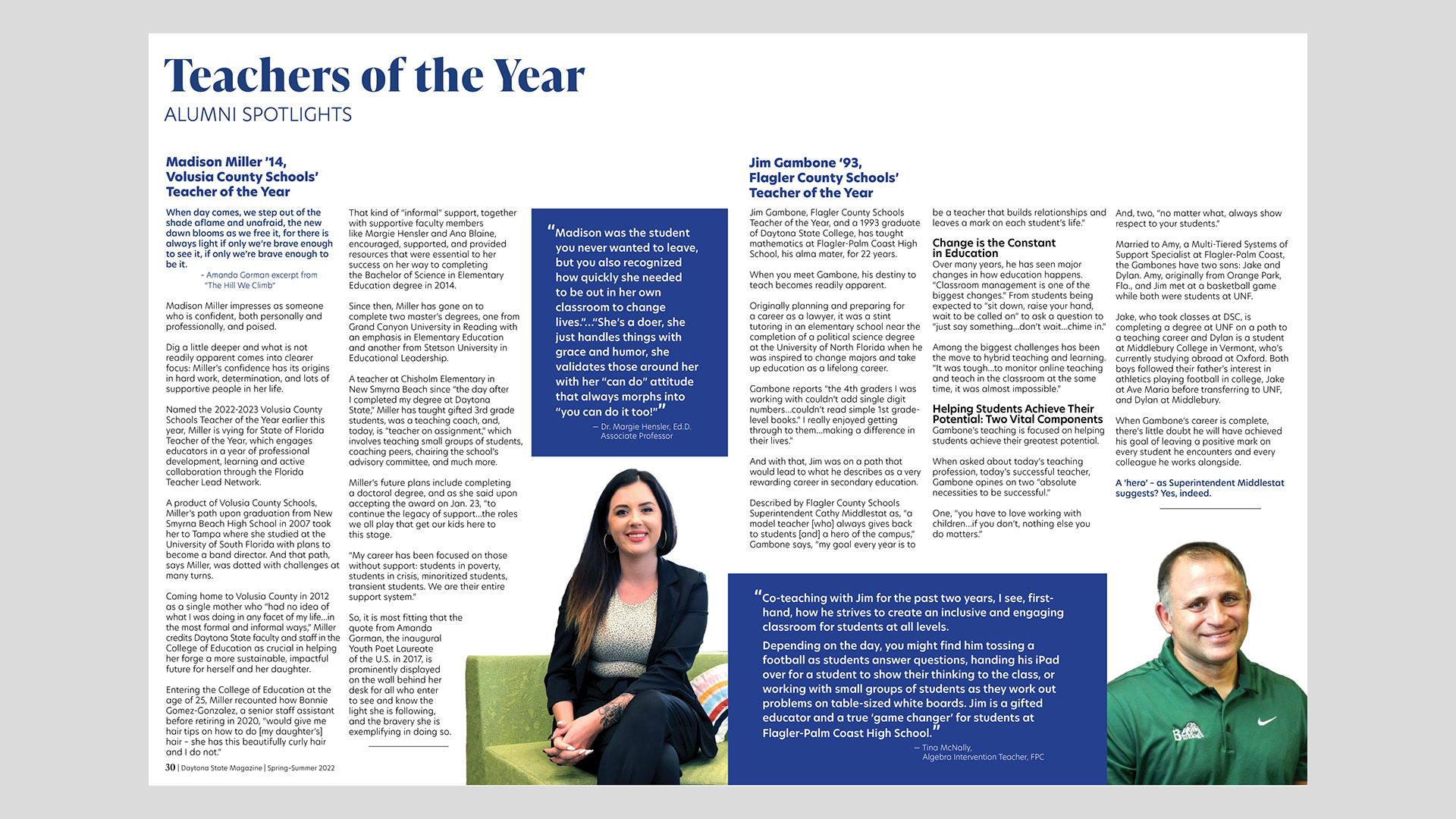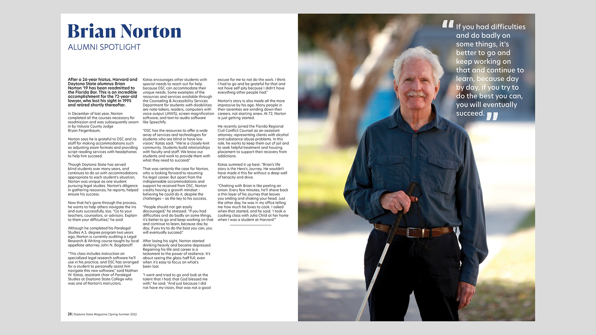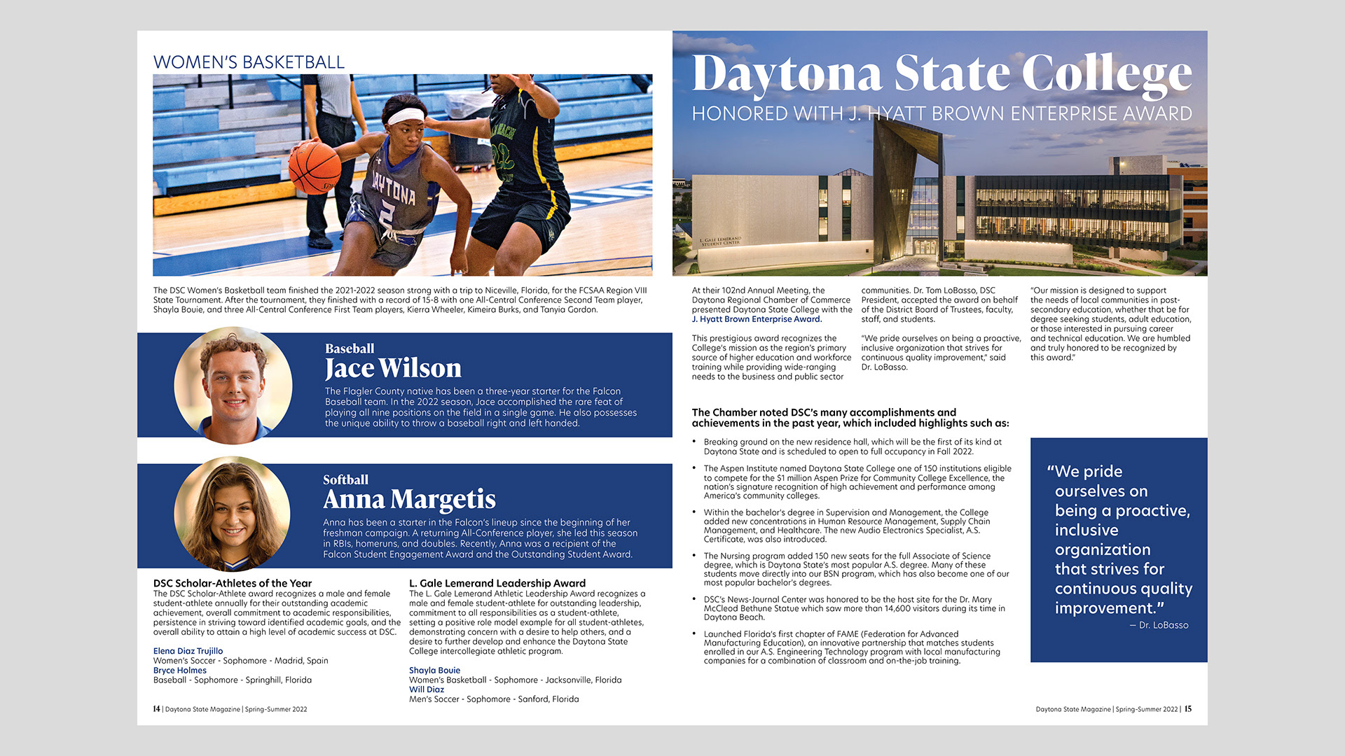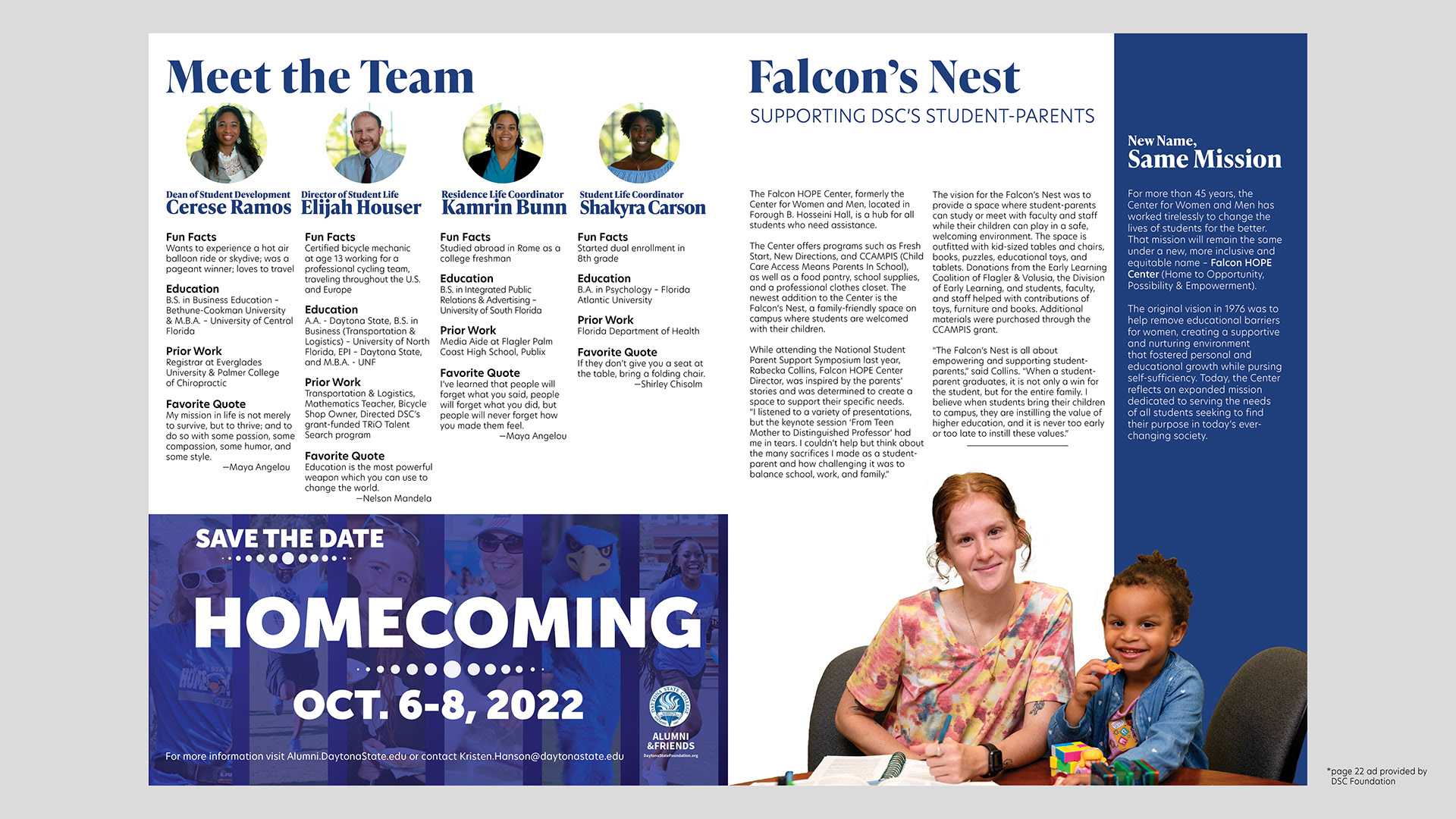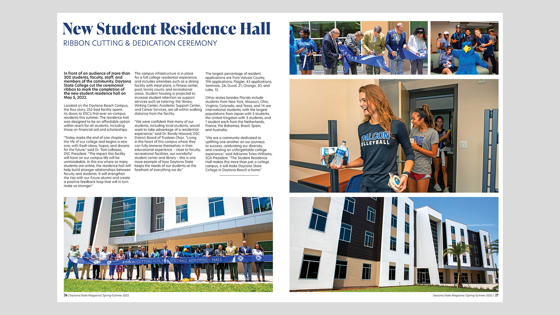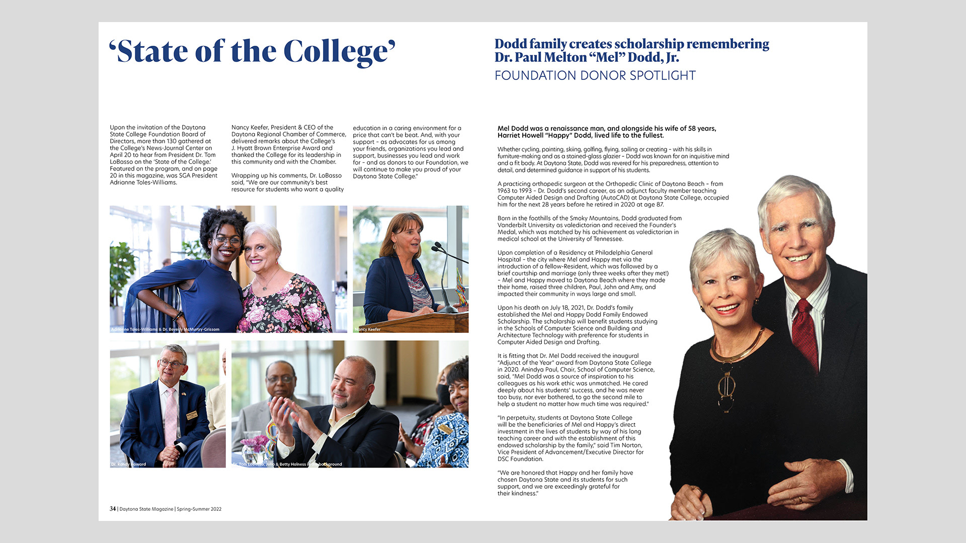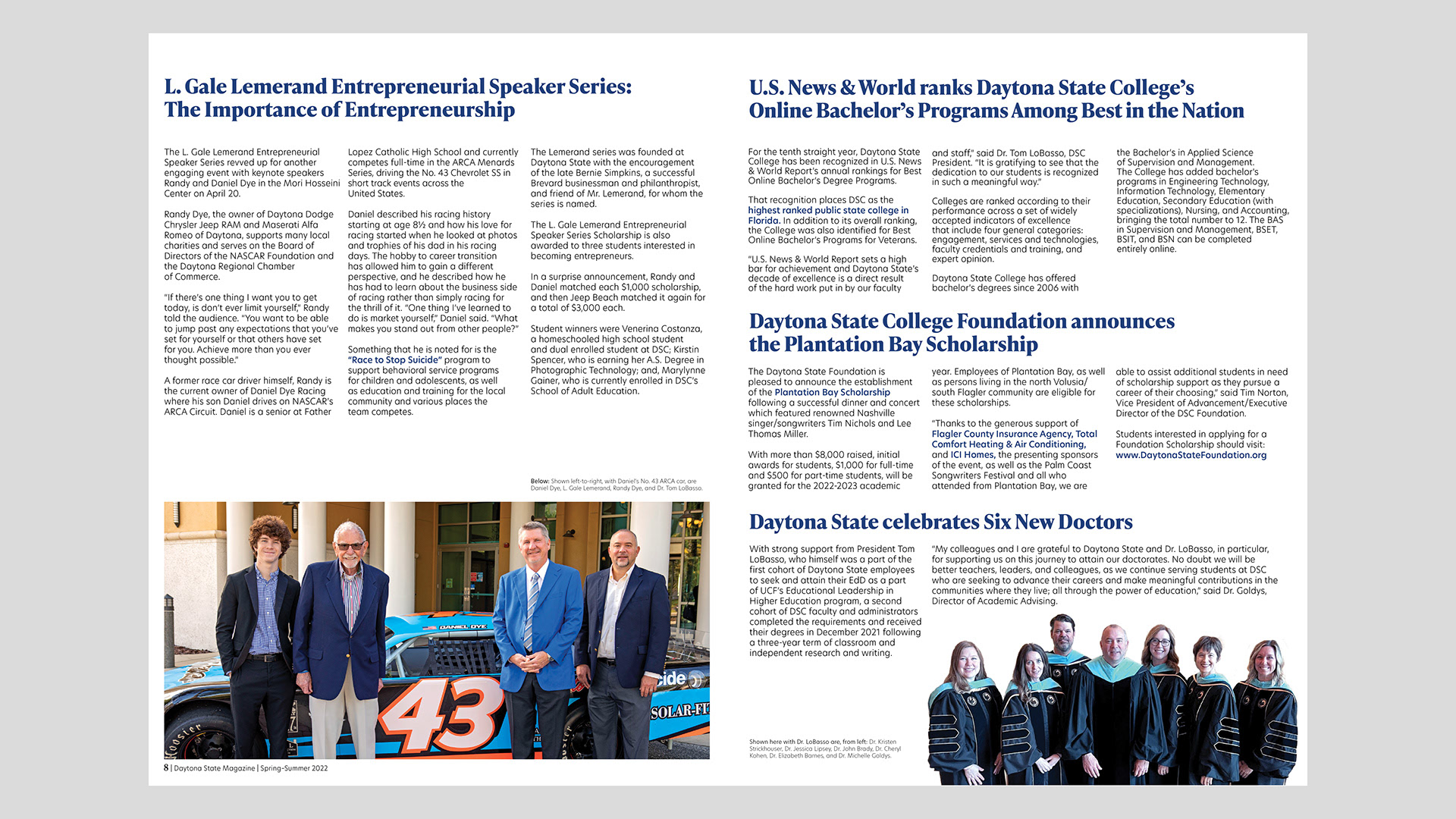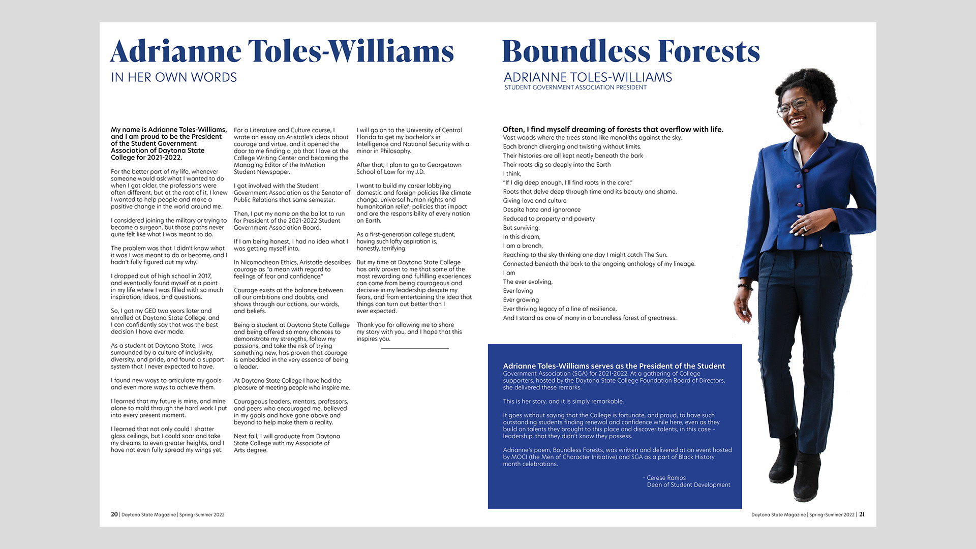
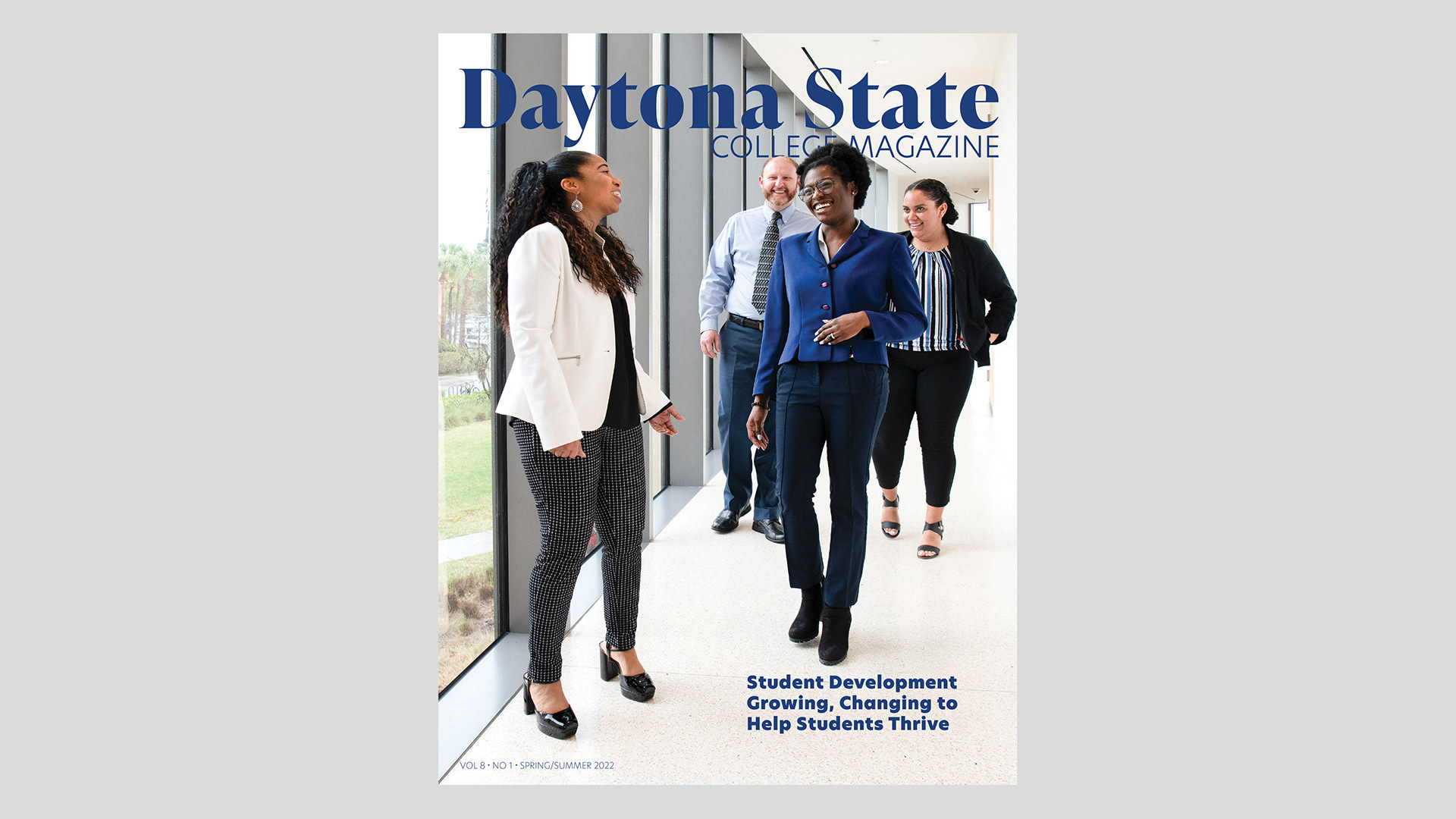
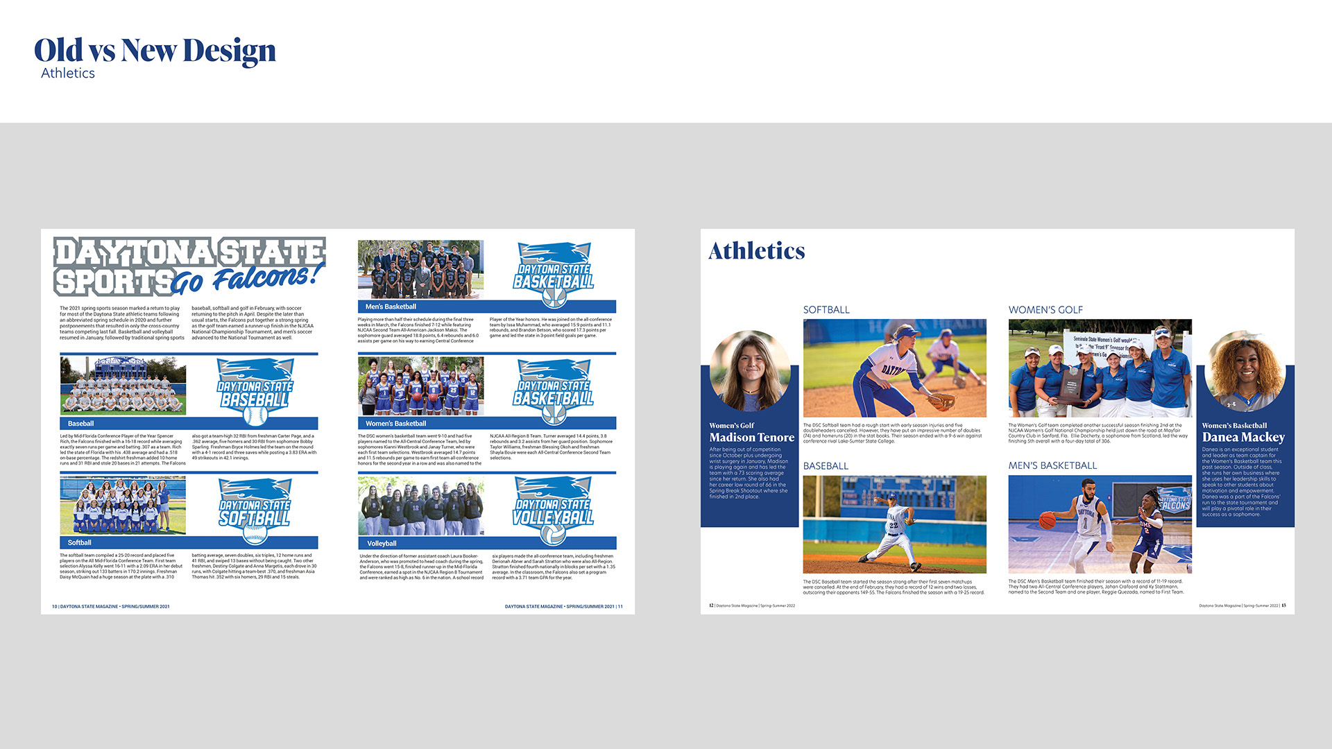
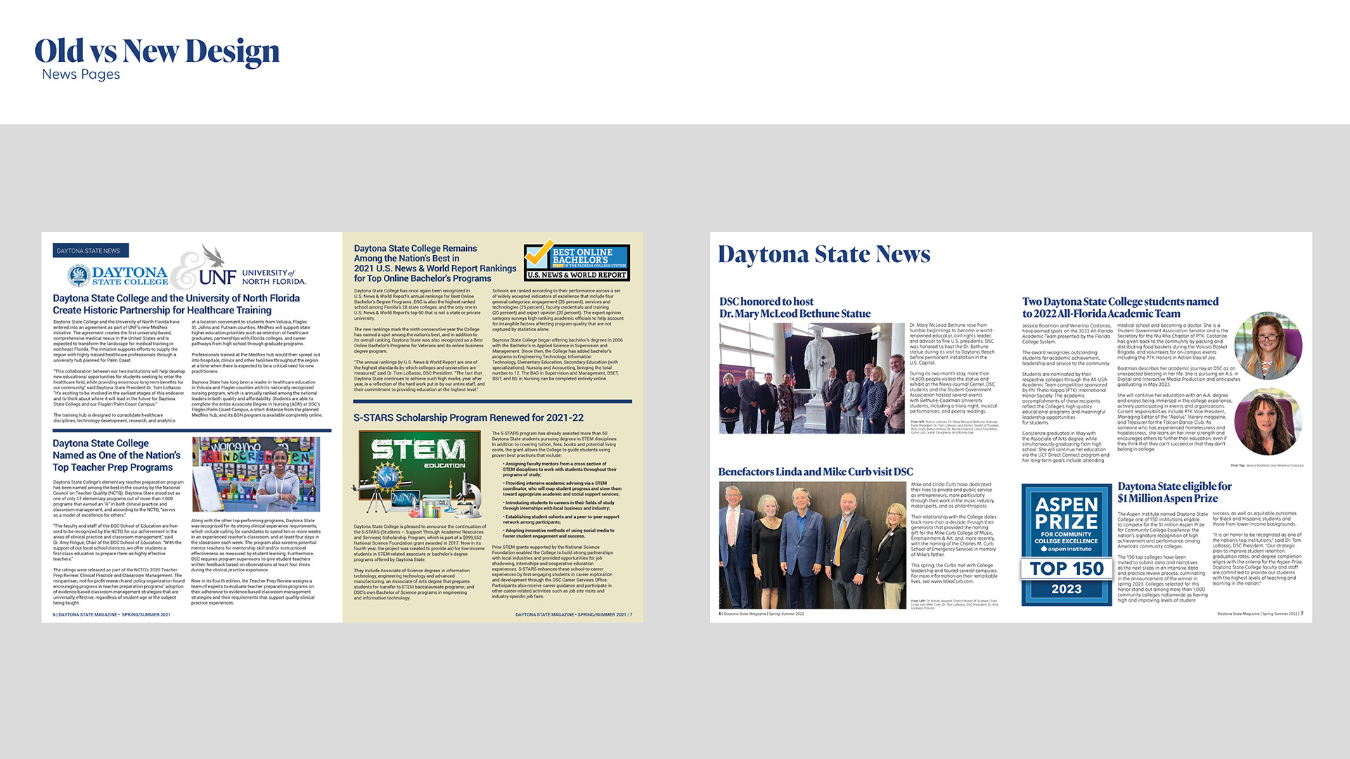
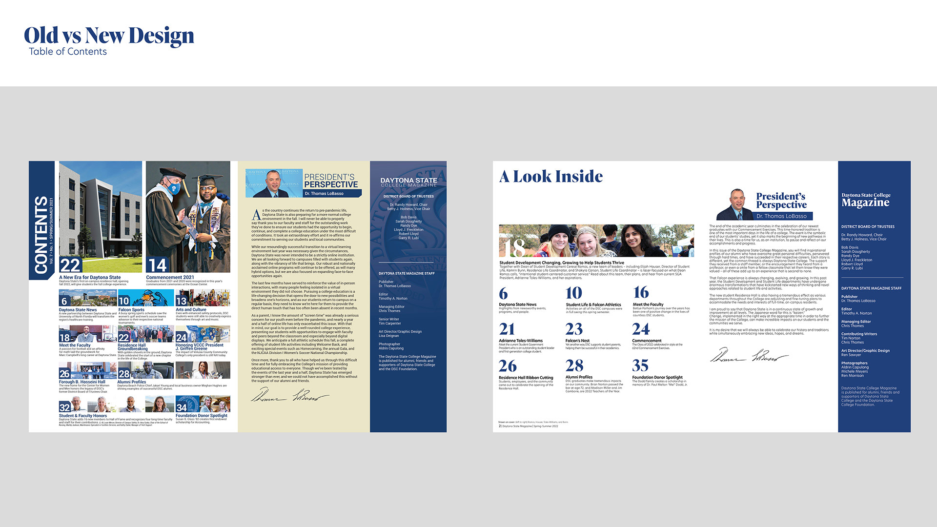
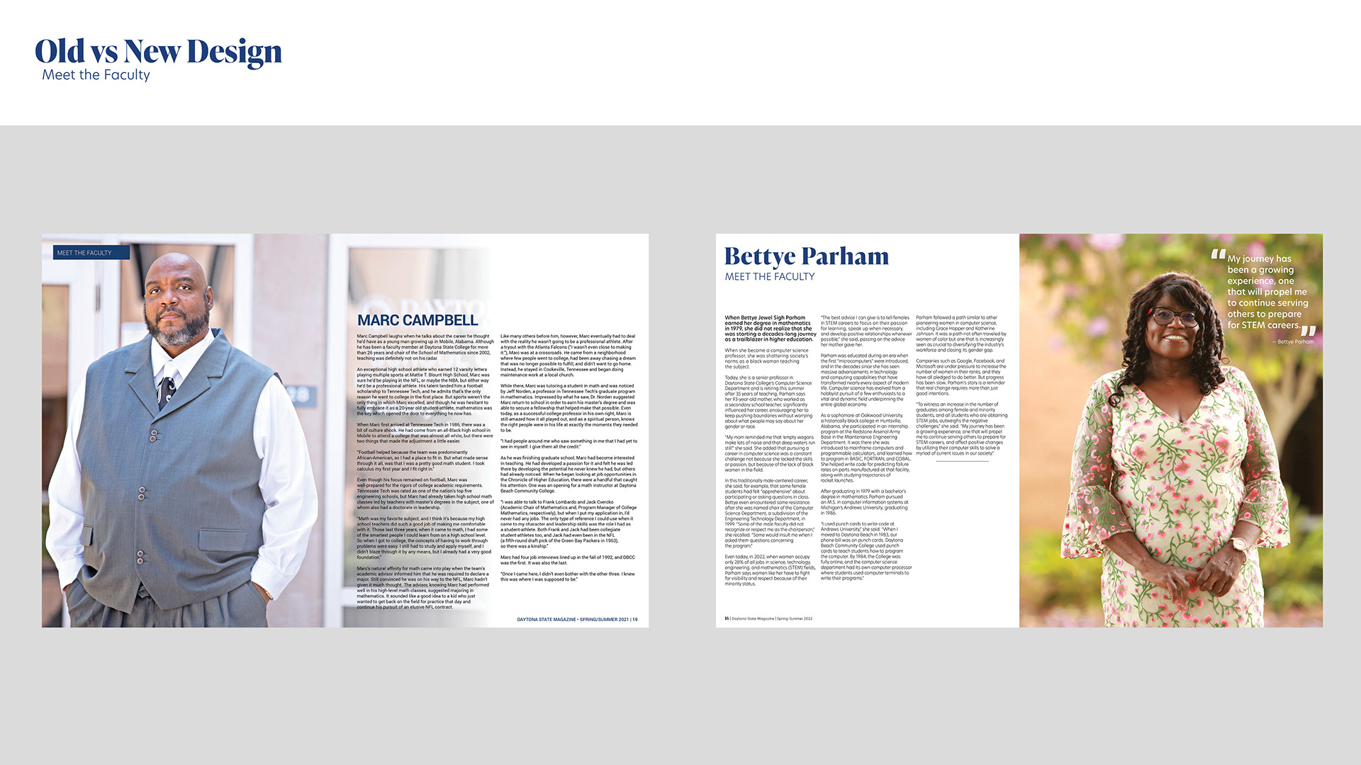
When asked to redesign the Daytona State College Magazine, I was excited to work on a ublication of its scale. The editor's primary pain points with the old design were: lack of white space, cluttered appearance, and dated feel.
My first step was to create a grid layout, as the previous magazine did not conform to any strategic page structure. Then I paired down the color choices to just white and blue, limited my text options to only two typefaces, and edited all of the photos to be as consistent as possible. After that, there was a lot of experimentation and collaboration that resulted in a cohesive and compelling final product.
Redesign Examples
Other Spread Examples