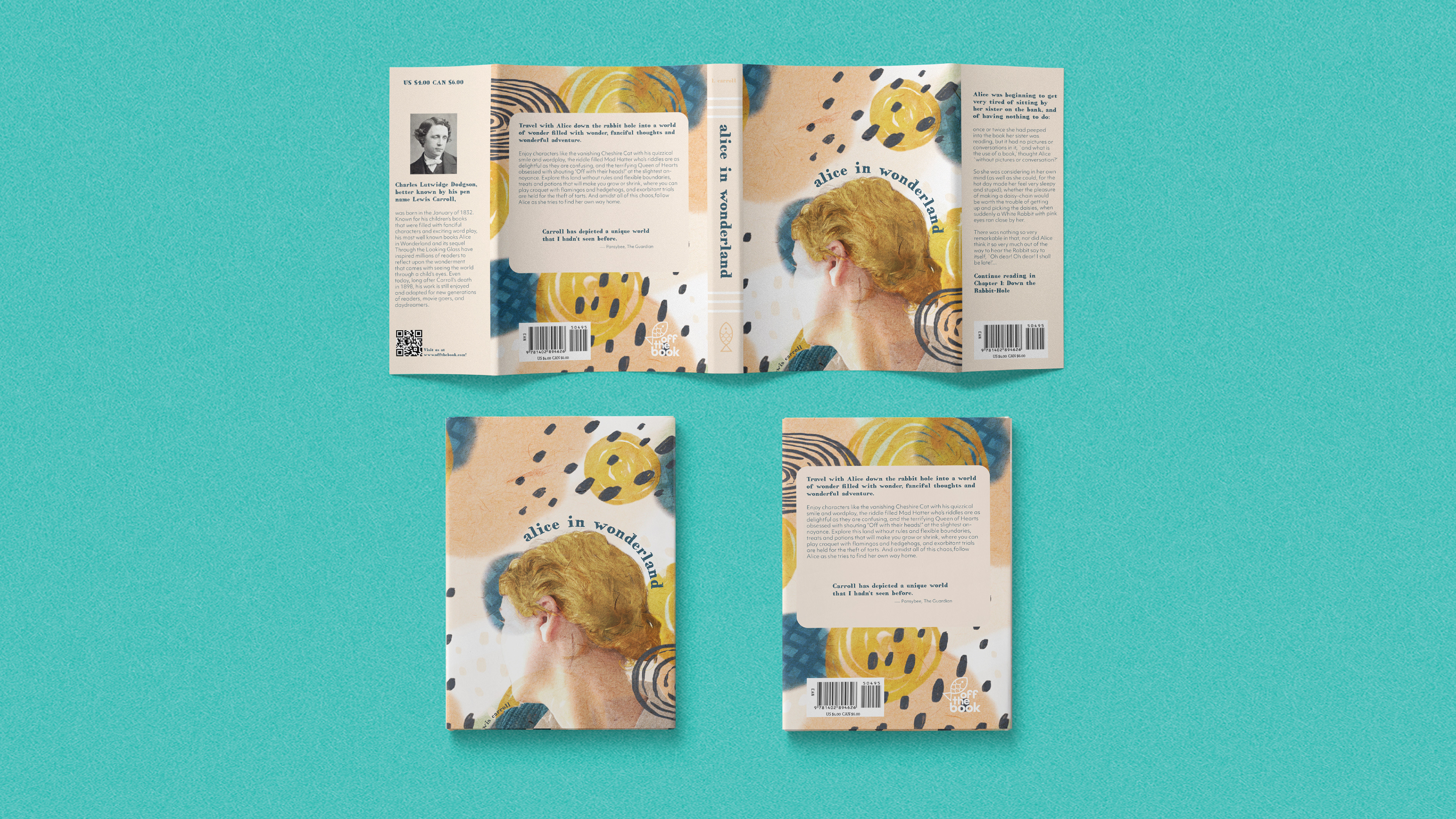
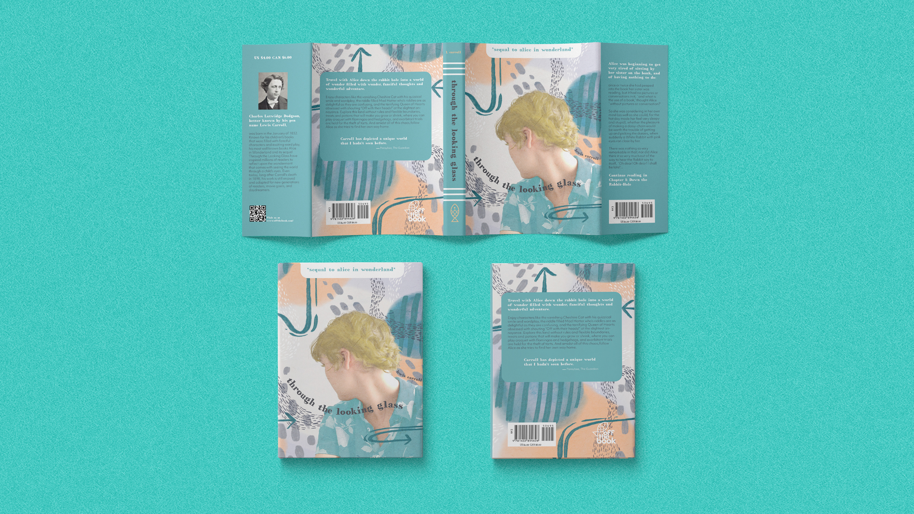
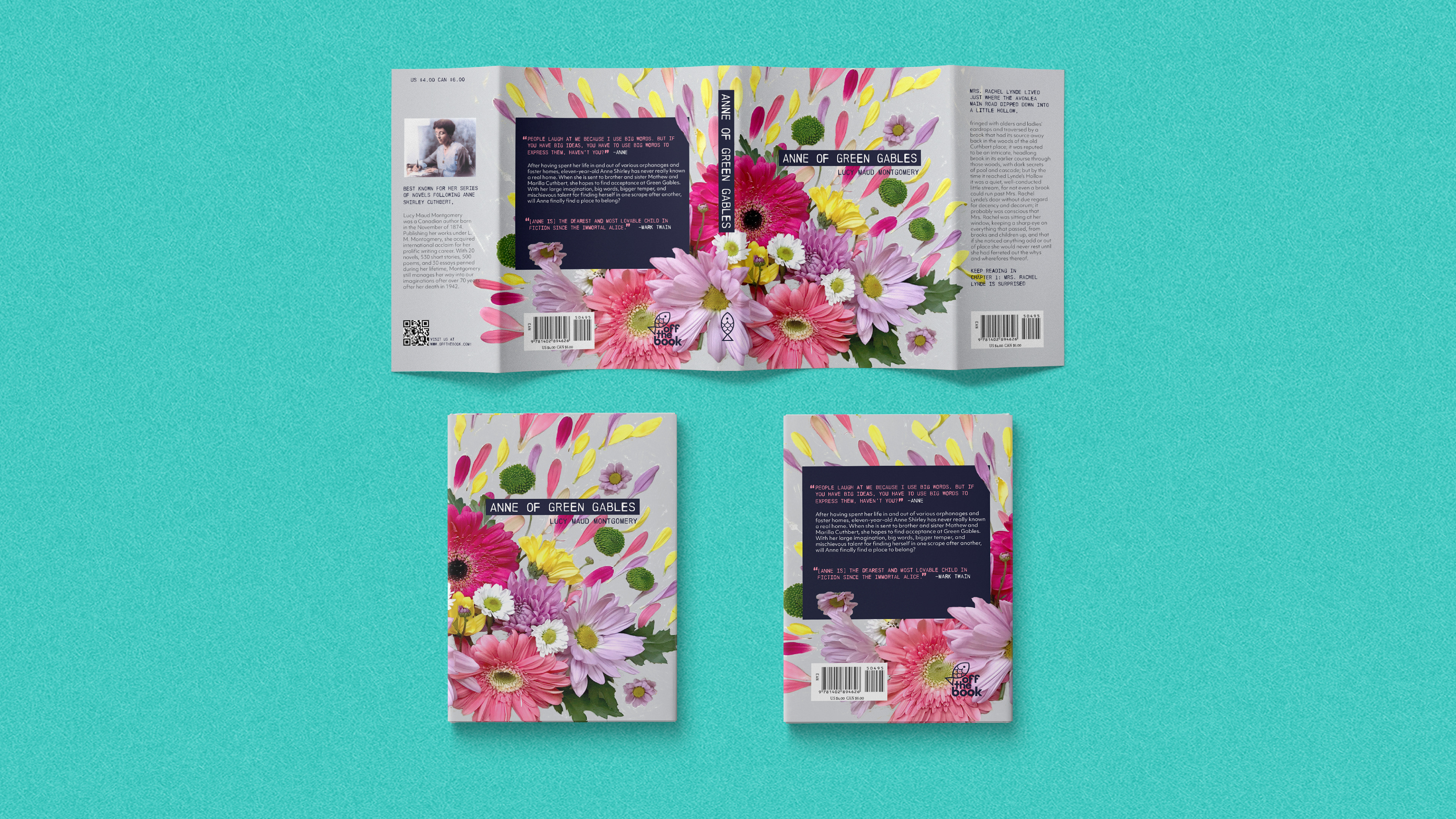
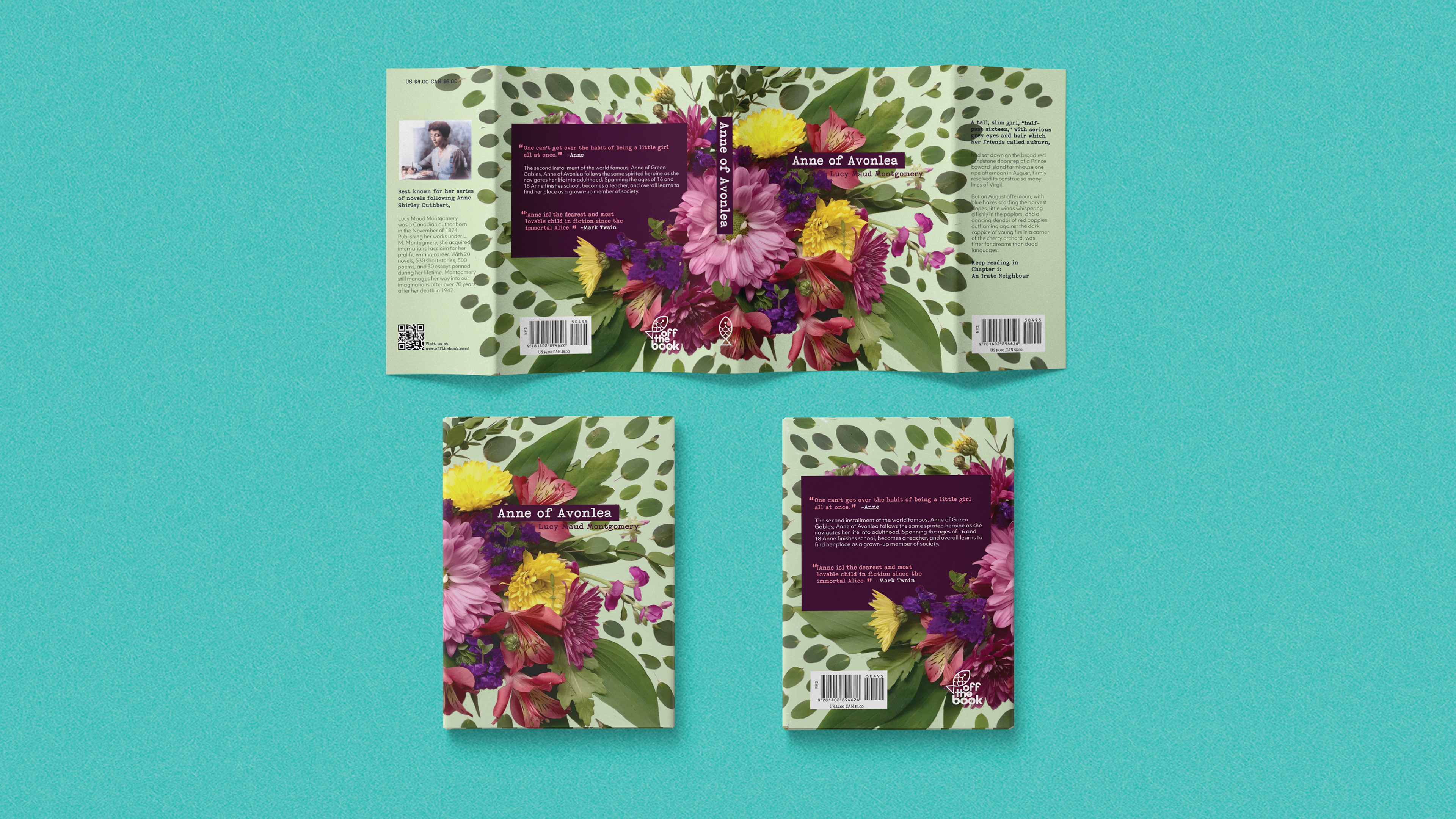
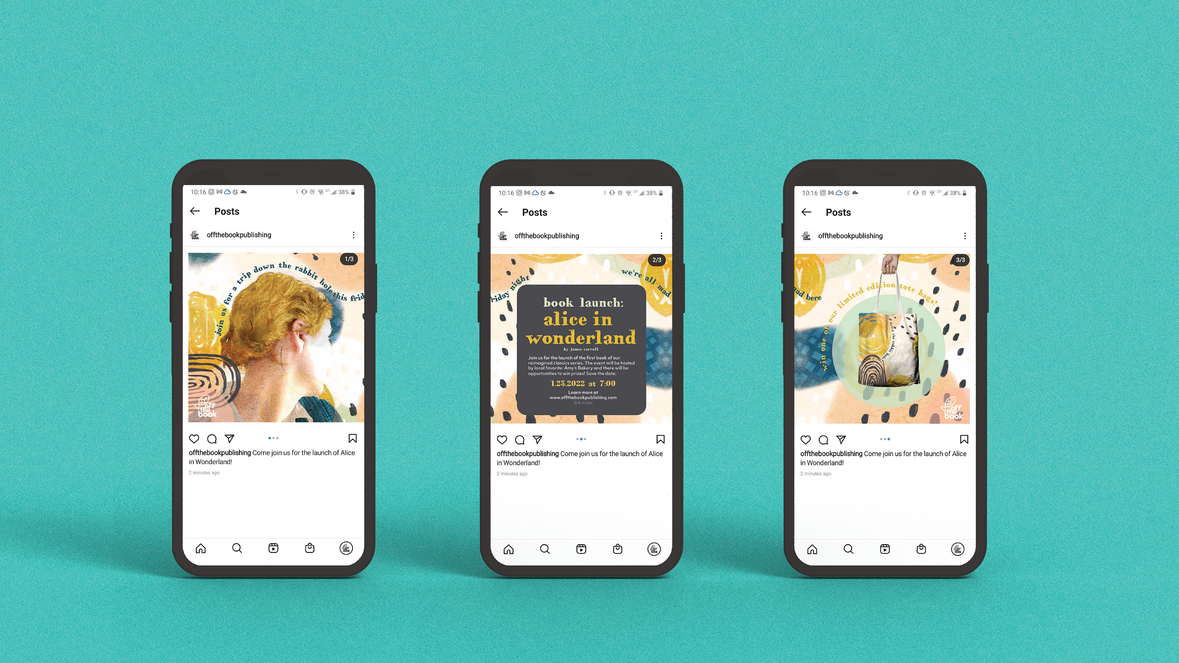
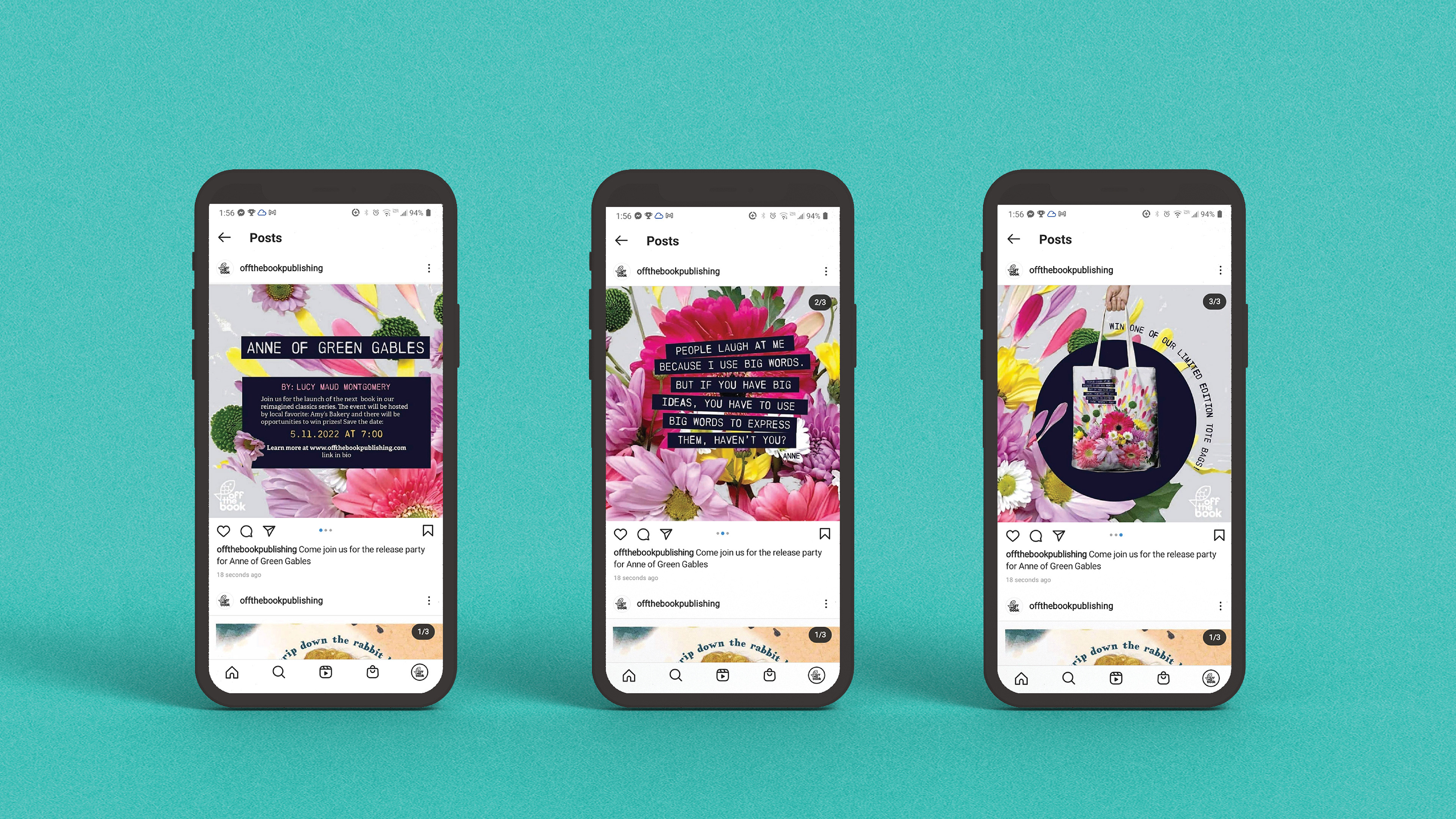
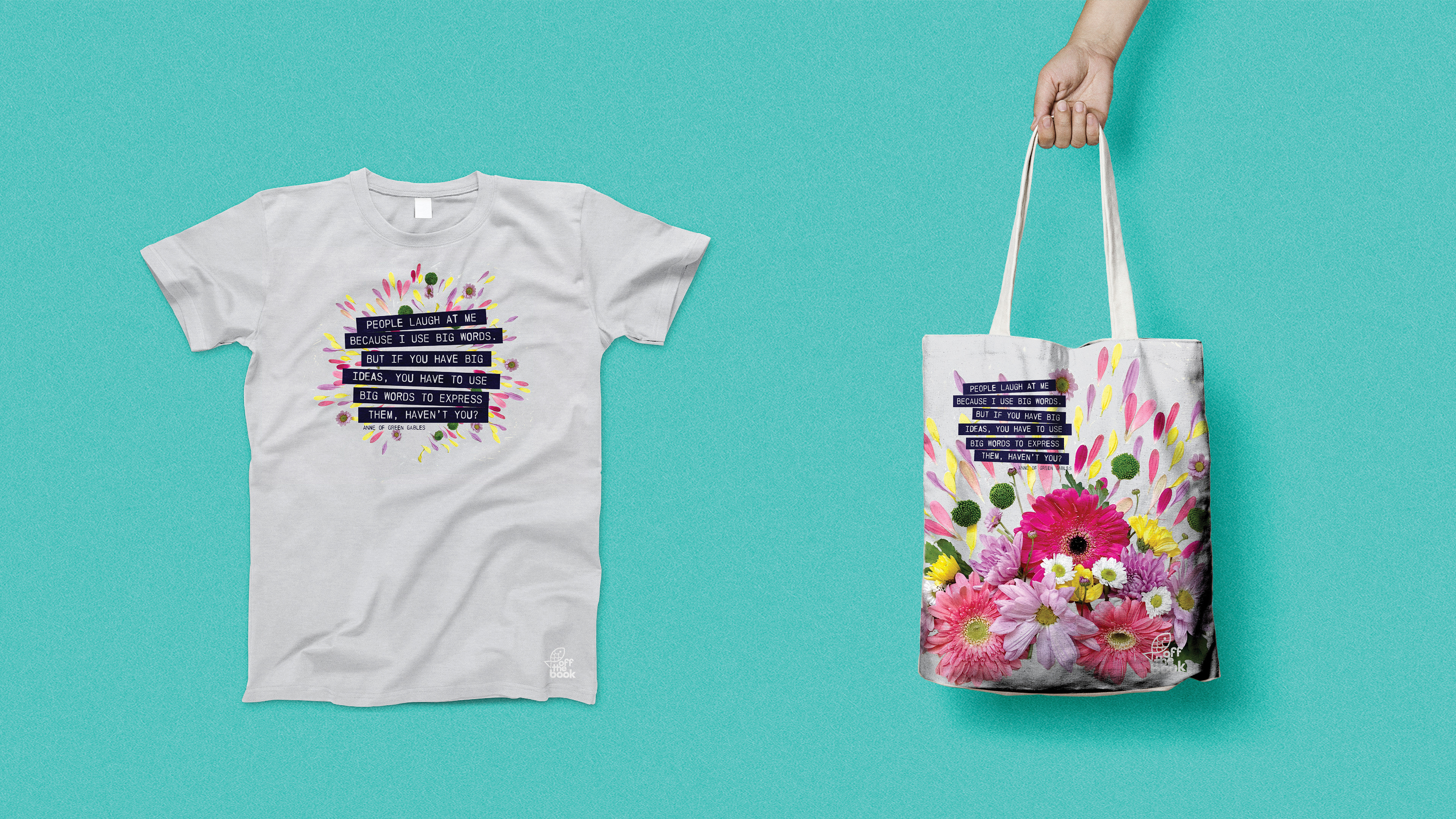
Classic children's books are underrated. At the very least, the oversaturation of modern twists on old characters has left the source material overlooked.
Most people are more familiar with adaptations than the originals, so this project serves to create fresh "identities" for some time-honored classics.
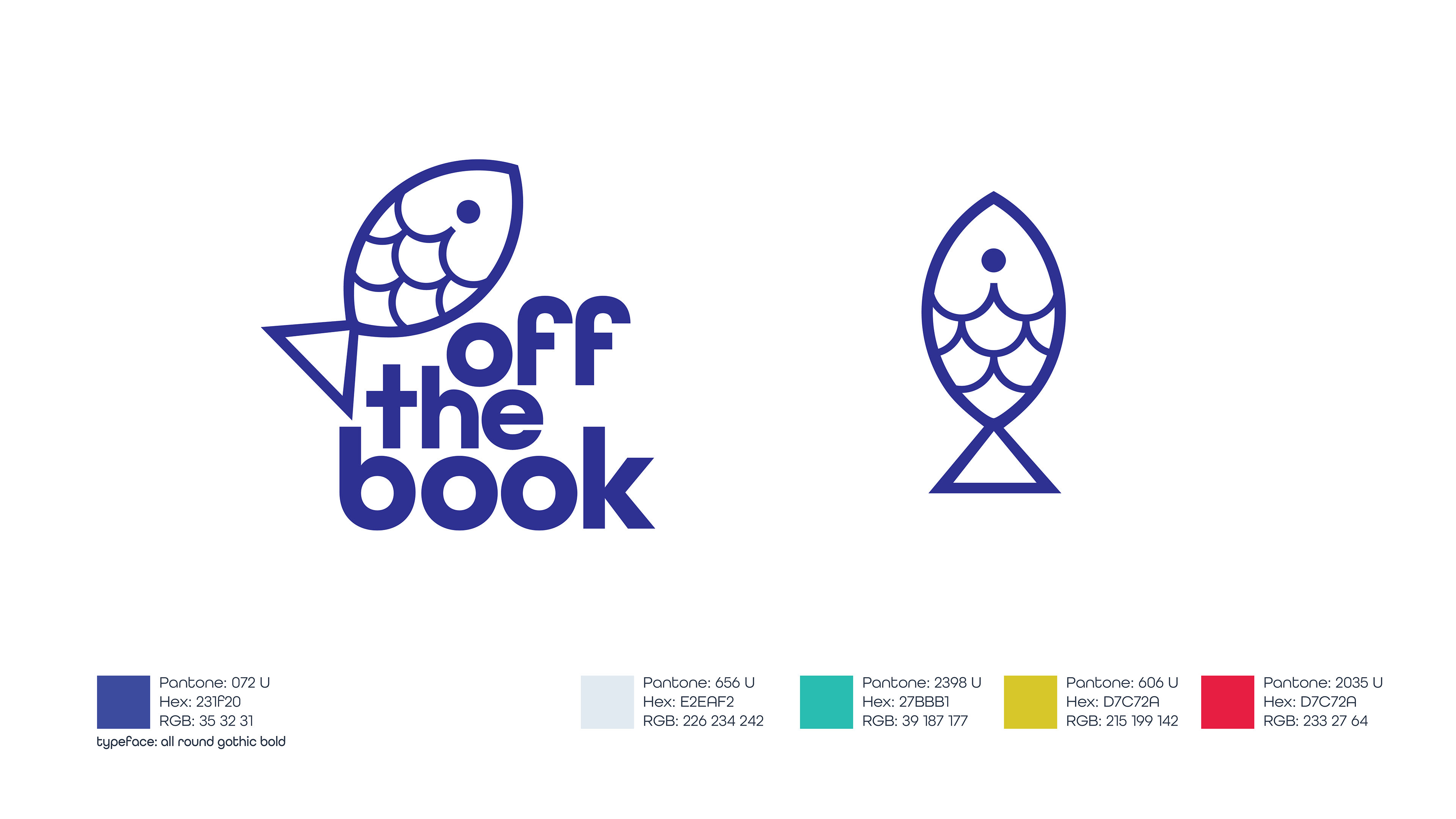
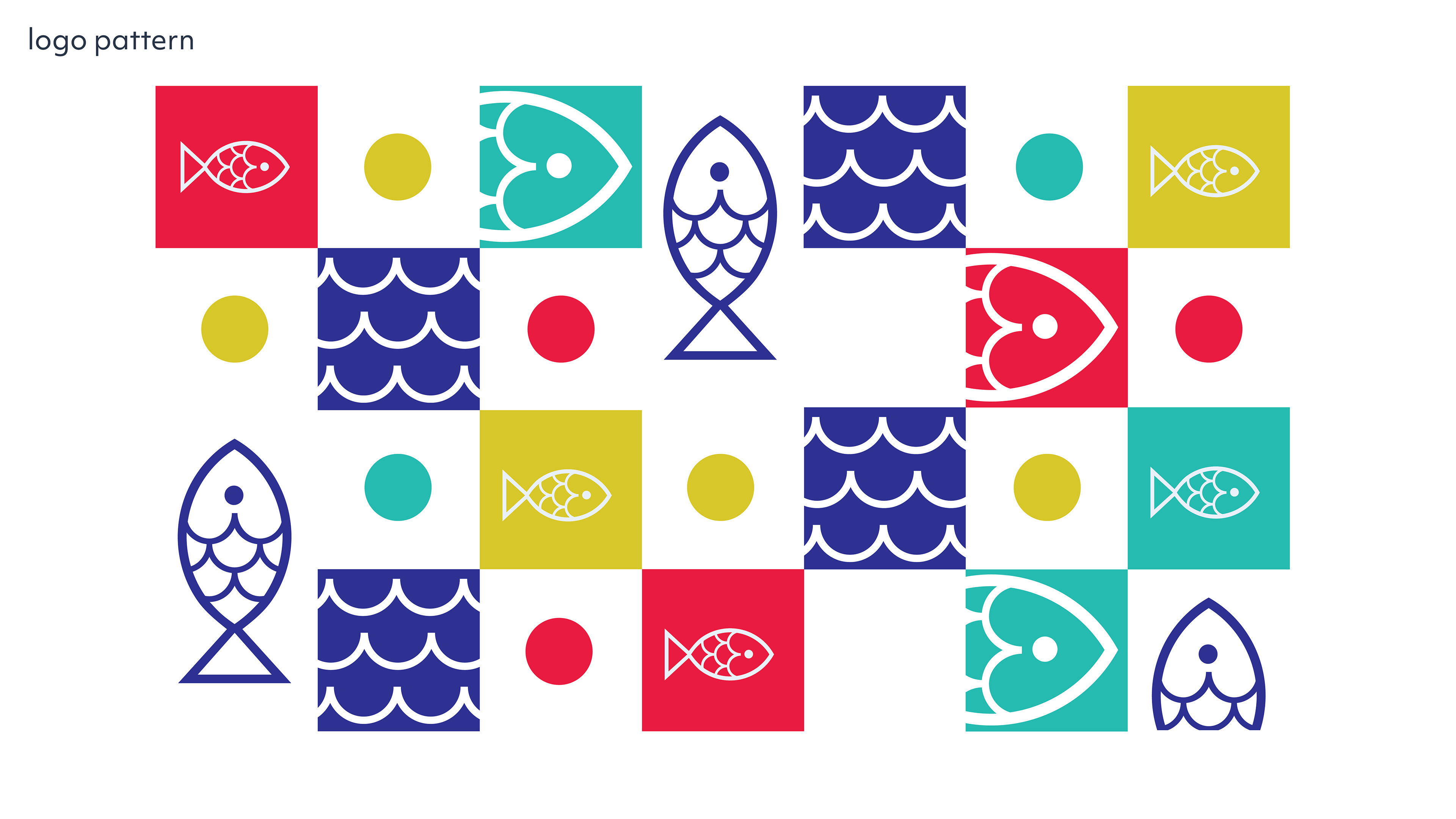
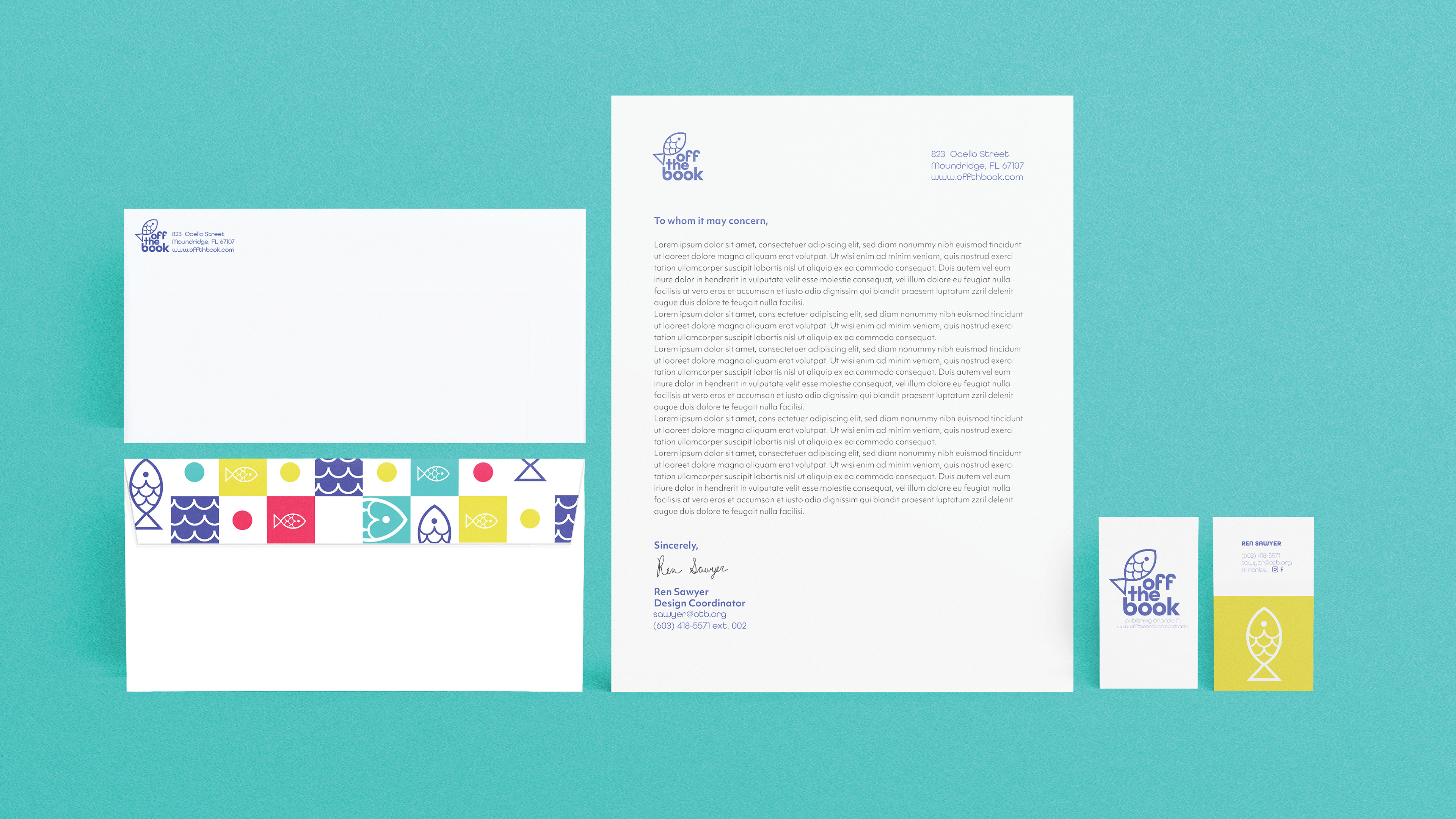
For the publishing company branding, the goal was to create something fun without being overly juvenile. The company name Off the Book was inspired by the phrase, "off the hook." To further the idea visually, a fish was used for the logo. Bright colors and bold, friendly type further the overall concept.